Tales from the Open Food Facts universe
Created by Florent Chehab, Ouiame Talbi & Stratos Triantafyllou.
Before diving in our stories, let’s describe a bit the field we are exploring.
Until the early 90s people bought products without really knowing their nutritional characteristics. A revolution was introduced at that time with the democratization of the Nutrition Facts table. Such table is a very useful summary of different types of nutrients in each product and is included on all food packagings nowadays. Usually, the table contains information on the amount of sugar, fat, proteins, salt, etc. in the product.
The data contained in those tables is transcribed in the Open Food Facts database (more info on the Open Food Facts Project is available towards the end). This information is at the core of the two (data) stories we wrote for you today:
“Green mythology”
Exploring food packaging colours with nutritional properties in mind.
“Show me your nutrients, and I’ll tell you who you are”
On the nutritional consistency of food product categories
Green mythology
Exploring food packaging colours with nutritional properties in mind
Have you ever heard of greenwashing? When Jay Westervelt coined this term in 1986, he had in mind companies or organizations that attempt to falsely present their products as “environmentally friendly”. With the turn towards healthier food consumption habits gathering momentum over the past couple of years, critics of the phenomenon have been increasingly vocal about companies using the green colour to appeal to consumers interested in natural, organic, less processed alternatives for their dietary needs. As an especially sarcastic one said, “that green tint may have more to do with dollars than chlorophyll”.
This phenomenon inspired us to try and learn more about the ties between green (or even other colours) and the nutritional properties of a product. Using the Open Food Facts database, we extracted twelve different hues from the images of ≈40 000 food product packagings. We analysed the presence or dominance of each hue on the packaging of the food product, globally, food category-wise and in terms of its nutritional composition of the products.
Do companies actively use green on their packagings in order to create an association with some mythical nutritional “benefits”? Let’s find out!
Food packaging: a marketing medium
Food and beverages have been merchandised for ages. For a long time, they were sold in rudimentary containers. From earthenware jars, glass jugs or wood crates and cloth bags, the focus was on simplicity and effectiveness, while more sophisticated packaging was mainly reserved for luxury goods. However, with more and more packaging materials and techniques becoming available to companies, manufacturing limitations dissolved and attention is now drawn on the impact packagings might have on consumers.
Since the 1950s, the science behind the creation of impactful packaging designs has expanded a lot. Many factors can make memorable packaging design: a flashy colour, some vivid imagery, attractive fonts and the right materials.
What we found is that to stimulate a consumer’s desire to buy their products, brands make a precise and clear use of colours on their packagings.
Indeed, when we rank each colour based on its dominance on a product packaging, we can see that three hues are undoubtedly dominant: red, orange and yellow.
Is there any explanation behind this trend?
The scientific article Impact of color on marketing explains that colour is used to differentiate a brand from its competitors by influencing the mood and the feelings of the consumer. The three dominant colours we have identified are known for their strong impact on customers’ attention and appetite. For instance, we learn from the above article that:
- “The red colour stimulates appetite because of its effect on our metabolism”,
- “The yellow colour is also employed to gain customers’ attention, increase their appetite, and encourage them to eat”.
As a result, it’s not surprising to witness that food manufacturers use those three hues a lot on their packagings.
Connecting colours, nutrition facts and product categories
Colour appears to be used on food packagings to influence consumer perception. But is there a relationship between the product’s packaging colours and its nutritional properties?
We analysed the distribution of the nutrition facts for each distinct hue used on food packagings.
As you can see below, we cannot really draw any conclusions about a product’s nutrition quality based only on its packaging colour. Still, the presence of some hues seems to be very characteristic for some nutritional value. For instance, the presence of blue-magenta seems to go along with products that have way more sugarzoom_in than other products.
You can explore other trends using the select field below.
Does the picture change when we look at product categories instead? From this new point of view (see plot below), we get a better understanding of the surprising distribution nutri-facts related to products with the blue-magentazoom_in hue: this hue is mostly used on sugary snacks and desserts, products that are expected to have unhealthy properties.
Other than that, we discovered some very clear trends:
- Bluezoom_in is mainly used for dairies and seafood packagings,
- Redzoom_in is very frequent on meat products: about 68% of meat packagings contains this hue,
- Magentazoom_in and pinkzoom_in are mostly present on sandwiches,
- Green-related hues (greenzoom_in, yellow-greenzoom_in, green-cyanzoom_in) are used in a wide variety of products with an emphasis on beverages and spreads.
You can explore other trends using the select field below.
Greenwashing
So, what about greenwashing? Are there food products that have a greenish hue as their dominant colour on their packaging, while being particularly poor nutritionally?
To answer those questions, we compared the density of the Nutri-Score (more info on what is the Nutri-Score is available towards the end) for products that have either, yellow-green, green or green-cyan as their dominant packaging colour to all other products. What we can see below is that, generally speaking, green is indeed a determinant factor when assessing the quality of a product: the green curve closely resemble the dashed black one but is shifted towards healthier values of Nutri-Score. Also we cannot observe any suspect statistical behaviour in the tail of the green distribution; which would be correlated with an absence of greenwashing.
If we look at another summary metric regarding how healthy a product is, i.e. the energy you would get from eating 100g of it; we can see a slightly different trend. There is a slight bump towards the end of the curves. Had this bump only been present on the green curve it would have meant that there is clearly a suspicious use of this colour. Here we cannot really conclude.
Even if we cannot mathematically conclude on the existence of greenwashing in the food industry, we looked a bit closer at the products located in the (last) bump of the green energy distribution and we found some clear example of it.
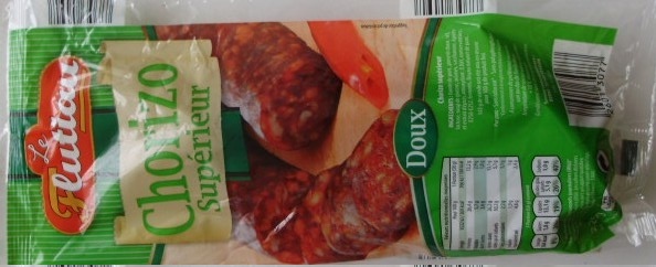
Such as this chorizo which is rated with a nice E on the Nutri-Score scale and has 1 900 Kj/100g; while using a lot green on its packaging for no obvious reason.
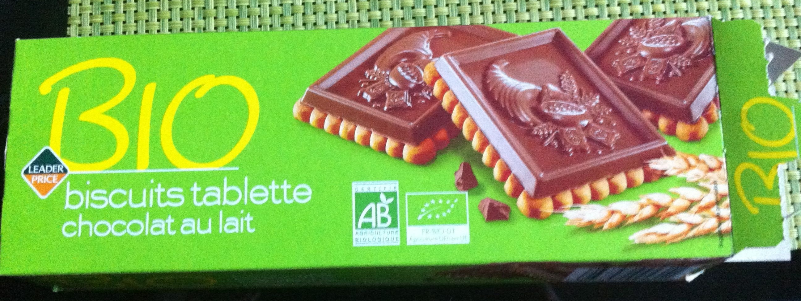
We also found a bunch of “BIO” (“organic” in French) products that proudly, and heavily, use green because it is the colour associated with that label. The issue is that some of these products have extremely bad nutritional properties and that the use of green here could be misinterpreted.
For instance, those “organic” biscuits are rated with an E on the Nutri-Score scale and have an energy value of 2 188 Kj/100g.
At the end we should be aware that green is not always synonymous with healthy.
Show me your nutrients, and I’ll tell you who you are
On the nutritional consistency of food product categories
When we talk about nutrition and health-related dieting, we usually share advice, insights and concerns in terms of food product categories. We talk about things like low-fat yoghurt, whole-grain pasta or sugar-free chocolate. These categories are just abstractions representing large collections of products, manufactured by different brands in different countries and made from different ingredients. Intuitively, we all think that product categories are nutritionally consistent, such that any product inside that category can effectively supplement each other in, say, a diet plan. But is that a fact? With nutrition currently in the spotlight and half of consumers adhering to a particular nutrition plan, this issue is hotter than ever.
In our analysis, we set out to find if product categories are homogeneous enough in terms of nutritional composition - and different enough from other categories - to support this popular belief.
Lost in abstraction, or how we ended up with a clustering task
Of course, a proper examination of our question requires information about product categories. However, as a collaborative database, whose size makes it hard to moderate, Open Food Facts is expectedly subject to inconsistencies: it contains inaccurate product information, data entry mistakes and missing data. In the database, each product is assigned to a series of categories and subcategories. Yet a considerable number of products are misclassified or unclassified. This makes the category tree ill suited for our analysis, and brought us to a cul-de-sac.
A solution that instantly came to mind had to do with the textual information about the products, particularly their titles. We could use some text-based classification on the names of the products, hoping that the resulting groups would point to actual product categories. Still, what about products that are similar text-wise but actually very different (e.g. “cream sauce” and “ice cream”)? What about products that are similar to each other, but quite differently names (e.g. “beef sausages with tomato” and “black pudding”)? Especially in an analysis that is all about nutrition, we would risk ending up with nutritionally irrelevant categorizations, like not discriminating between high- and low-sodium cheese.
Hopeless about finding a starting point that could lead us to nutrients, we came up with a new idea: why not start from the end? Why not start from the nutrients themselves and work our way back? If product categories are nutritionally consistent and different from each other, then it should be possible to think of them as groups of products that share strong nutritional similarities.
In other words, we reformulated our analysis as an unsupervised task. We did not take category information as our data; we clustered products based on their nutritional composition and attempted to discover the categories ourselves. Clusters of nutritionally similar products that hint at a specific product category indicate that this category might be nutritionally consistent. Reversely, if more than one cluster represent the same product category, then this category might not be nutritionally consistent.
Setting up the clustering model
In our model, we used the nutrition fact columns, which typically provide information for each nutrient per 100g/ml of the product. We decided to control for serving size by translating nutritional information from the per 100g/ml level to a per-serving level, in order to get a more meaningful feature space. The final input to the clustering model included ≈126 000 products and fourteen features (with no missing values in that subset of products): energy, carbohydrates, proteins, fat, saturated fat, trans fat, sugars, sodium, fibre, cholesterol, calcium, iron, vitamin A and vitamin C. This final sample contained approximately one fifth of the full database, but was still representative.
As for the clustering method, we opted for DBSCAN, as it can scale to a large dataset, it is robust to noise and outliers and we considered its density-based approach more suitable for handling the subtle nutritional differences between similar categories, such as yoghurt and cottage cheese.
Results
Our clustering model identified 182 core clusters, most of which were quite consistent in terms of the nutritional composition of the products comprising them. In order to interpret each component, we created a cluster profile for it, looking at the size, the average values for the nutrition facts and the names of the included products.
The overwhelming majority of these clusters actually represented product categories. Besides, more than 90% of the products in each cluster were missing product category information in the original dataset. Moreover, as we would expect, the model grouped together products which are in the same category but do not share textual similarities, such as “licorice candy” and “jelly slices”, or “trail mix” and “honey roasted peanuts”.
It is also worth mentioning that there were cases of clusters that represented the same category. In some of these cases, this was the result of inconsistencies in the underlying data. For instance, the model created two different components that both pointed to chopped spinach. We checked the nutrition facts in each cluster, and discovered the only difference between them was that in the second group, sugar content was zero - indicating a missing value. Among cases that did not occur due to inconsistencies, we found that the phenomenon was much more frequent among highly processed foods, such as ready-made sauces and fruit cocktails in syrup. Less processed food, such as vegetables and oats, appeared in single clusters.
Interestingly enough, the model managed to cluster only 31% of the data, considering the rest of the dataset as noise. It is not clear whether this can be attributed to the actual relationship between nutritional composition and product categories, or to the limitations of the algorithm supporting the model. DBSCAN is able to locate clusters of similar density and this is why it does not usually perform well when clusters of varying density are present. This might partly explain both the large number of unclustered data, and some cases of products from the same category appearing in different clusters. A future analysis could limit this by using OPTICS or HDBSCAN, which have a notion of hierarchy in their design.
Are categories nutritionally consistent after all?
Our results suggest that this question might be open to more than one valid answers, and strongly connected to the specific kind of food and category abstraction level we are talking about. We saw that for some kinds of food, including vegetables, nuts and cheese varieties, the product category has a nutritional meaning. On the other hand, especially when it comes to processed foods, one should probably be more careful in deciding between alternatives.
The notion of nutritional consistency inside many categories makes it possible to identify food manufacturing malpractices. If 19 out of 20 mozzarella cheese brands have the same nutritional composition, then something might be wrong for the 20th one.
Finally, we saw that our DBSCAN model was able to extract clusters that represent actual product categories using only nutritional information. In the context of the Open Food Facts project, this could lead to a new way of categorizing products and impute missing category labels.
More info
Regarding the Open Food Facts Project
The Open Food Facts database is a community built database gathering information about food products from all around the world. It is freely available under the Open Database License and gives access to many contributed information related to several hundred thousands of products: list of ingredients, nutritional information, food category, images, etc.
Back to where this was referenced.
Regarding the Nutri-Score

Some institutions, including the French government, have tried to summarize even more the nutritional facts of the products to facilitate the understanding of consumers. As a result, researchers have come up with a decision tree that maps a nutrition fact table to a value between approximately -10 (best nutritional quality) and +40 (worst nutritional quality); this value, which is known as the Nutri-Score, is then projected on a scale of 5 levels: from class A, the healthiest products, to class E, the least ones.
Back to where this was referenced.
Credits
- Cover image is in the public domain: https://flic.kr/p/QJUosJ,
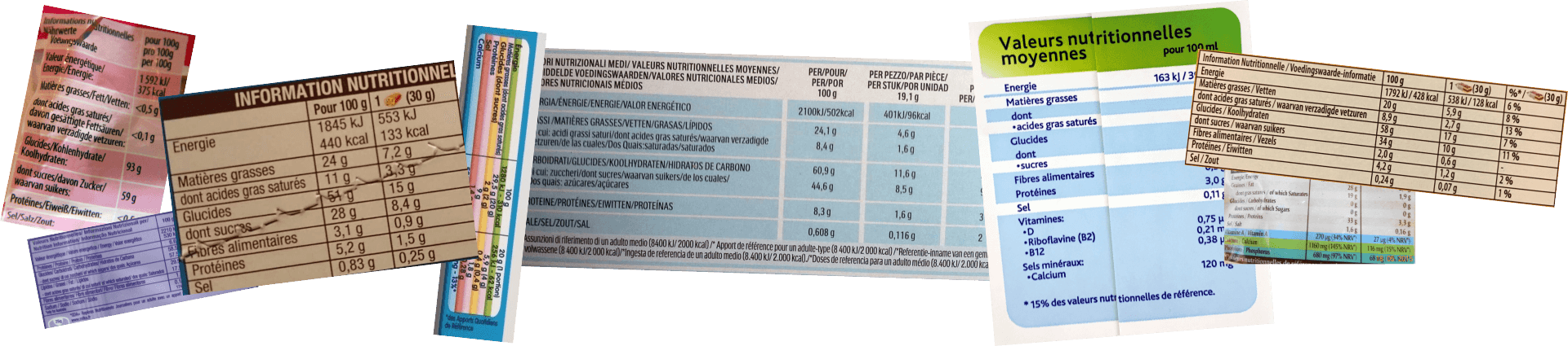
- Nutri facts banner: assembly of pictures from Open Food Facts (released under CC BY-SA 3.0),
- Packaging images taken from Open Food Facts (released under CC BY-SA 3.0),
- Full data analysis is available on Github (released under BSD 2-Clause “Simplified” License),
The content of this website is released under CC BY 4.0 (Attribution 4.0 International).